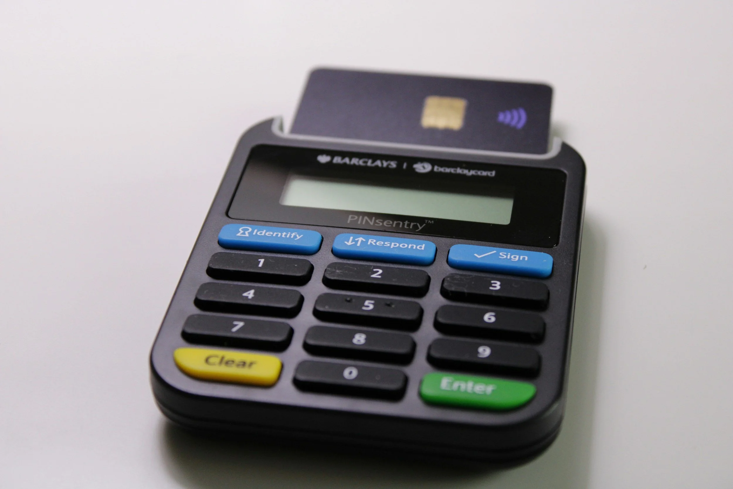
Barclaycard Precisionpay
Virtual Card for SAP Ariba
Role: UX Designer (in a multi-disciplinary team)
Client: Barclaycard, with Deloitte as delivery partner and SAP as platform owner
Year: 2021
Tools: Sketch, Axure, SAP Fiori 3, InVision Freehand
Executive Summary
Barclaycard wanted to embed its Precisionpay virtual card into SAP Ariba and a new SAP Fiori Launchpad application, so corporate buyers could pay suppliers straight from a Purchase Order without leaving their ERP. Working as a UX designer in a multi-disciplinary team across Barclays, Deloitte and SAP, I owned the buyer journeys end-to-end — mapping nine procurement scenarios into three coherent flows, building the full design system on top of SAP Fiori 3, and signing the work off against Barclays' accessibility standards. The project hit its kick-off timeline and gave engineering a build-ready spec with no bespoke component arguments to resolve.
1. Discovery & Research
Situation & Stakeholders
Three organisations, three points of view: Barclays as the product owner, Deloitte as the delivery partner, SAP as the platform. The brief was thin and the acronyms were unexplained — VC, CDF, GL cost, card pool, ERP, CIG. Before any pixel was drawn, I wrote every open question down (spend caps, commission, card-pool limits, custom field semantics) and turned it into a single shared working document the three teams could update. It surfaced contradictions early, kept everyone honest, and meant nothing could be quietly forgotten.
Competitive & Pattern Analysis
Rather than benchmarking consumer checkout flows (the wrong reference class for a B2B procurement tool), I studied how leading enterprise platforms handled the PO-to-payment moment:
SAP Ariba native flows: strong object-page consistency, but the existing payment hand-off forced users to leave the PO context — exactly the friction we were trying to remove.
Coupa & similar P2P suites: good bulk actions, but heavy modal stacking that didn't survive screen-reader testing.
Existing Barclaycard portals: trusted brand patterns, but desktop-only assumptions that wouldn't pass current accessibility standards.
This shaped two early principles: stay inside the Fiori object-page paradigm so the app feels native, and design every action so it works inline rather than in a modal stack.
User Personas
The buyer side had two clear archetypes:
The Buyer Admin — configures vendors, custom data fields and user access for hundreds of lower-level users. Needs bulk operations and predictable permissions.
The Requester / Approver — lives inside the PO list, wants to pay a supplier in as few clicks as possible, and cares about reconciliation accuracy more than visual polish.
"I just need to pay this PO and get the reconciliation right. I don't want a six-step wizard for something I do twenty times a day." — Buyer persona, requirements workshop
2. Ideation & Information Architecture
Mapping the Scenarios
The functional spec listed nine scenarios — approved/unapproved POs, with and without follow-up documents, paid and unpaid invoices, and one-time vendors that may or may not exist in the ERP. I collapsed them into three buyer journeys plus an ad-hoc one-time payment flow, so the IA reflected user intent rather than back-end state.
Sketching & Low-Fi Wireframes
First-pass flows were sketched in InVision Freehand to test with the Deloitte BA and Barclays product owner before committing to Sketch. The core focus was reducing cognitive load at the moment of payment: surface the right line items, the right card pool, and the right reconciliation fields without asking the buyer to remember anything from the previous screen.
The Wizard vs. Inline Decision
A senior stakeholder pushed hard for a wizard-style "create payment" flow. Rather than push back verbally, I built both — the multi-step wizard and an inline action triggered from the PO list — and walked the room through click-counts, error states and reconciliation impact for each. The inline pattern won on merit. Putting the business goal (the kick-off success metric was first payment processed E2E within the agreed timeframe) ahead of the loudest voice kept the conversation civil and the timeline intact.
3. Iteration & Usability Testing
Testing Method
Participants: internal Barclays and Deloitte SMEs acting as proxy buyers, plus a Barclaycard accessibility reviewer
Methodology: moderated walk-throughs of each journey against the nine functional scenarios
Core tasks: generate a virtual card from an approved PO; pay multiple POs in bulk; raise an ad-hoc payment to a vendor not in the ERP
Revisions Based on Testing
Before: users on the PO list couldn't tell which orders had a partial-payment risk until after the card was generated. After: added a warning state and inline status pill to the PO row so reconciliation issues surfaced at the moment of decision.
Before: the bulk "select multiple POs" action hid the running total. After: persistent footer summarising selected count, value and target card pool — with a clear primary CTA.
Before: Custom Data Fields were initially scoped as hard-coded. After: reworked as admin-configurable, because every customer's ERP is different and locking the schema would have broken the seamless onboarding success metric.
4. Visual Design, Design System & Handoff
I built the full design system for the project on top of SAP Fiori 3, so engineering inherited components they could implement on day one rather than bespoke screens to argue about. That included:
Colour variables and tokens — primary, secondary, semantic (success, warning, error, info), surface and text levels, all mapped against Barclays brand and Fiori semantic colours
Typography: font styles and paragraph styles for headings, body, captions, table cells, form labels and helper text
Buttons: every state — default, hover, focus, active, disabled, loading — across primary, secondary, ghost and destructive variants
Components and variants: PO list rows (default, selected, warning, partially paid), object-page headers, status pills, form fields, modals, footer toolbars, navigation, custom field editors
Patterns: error and empty states, bulk-selection footer, inline validation, confirmation screens
Accessibility was a design constraint, not a QA pass. I ran every screen through Barclays' Browser-Based Design Standards assessment template, fixed contrast, focus order and screen-reader labelling myself before handover, and documented the rationale alongside the spec so developers didn't have to guess.
Why these decisions, not the others
Inline payment action over a wizard: lower cognitive load for buyers already inside the PO list; fewer abandoned flows; matches Fiori's object-page pattern so it felt native, not bolted on.
Custom Data Fields admin-configurable, not hard-coded: protects per-customer onboarding speed.
Bulk update for user access: the admin persona managed hundreds of users; one-by-one was technically correct but operationally unusable.
Warning state on the PO list before partial payment: stopped reconciliation errors at the source.
Component-driven design system: removed ambiguity at handoff and kept future iterations cheap.
5. Reflections & Takeaways
Ask the dumb questions early. The acronym list everyone was too senior to query was the single biggest blocker. Writing it down unblocked the whole team.
Build the alternative, then let the data choose. Disagreements with senior stakeholders went much better when I prototyped both options instead of arguing for one.
Accessibility is a design constraint. Treating WCAG and the Barclays standards as inputs — not a final-stage gate — changed what I drew, not just what I shipped.
A design system pays for itself in the first sprint. Investing in tokens, variants and states up front meant zero "what does the disabled state look like?" emails during build.
Collaborate early with engineering. Walking the SAP and Deloitte engineers through Fiori component choices before lockdown caught two API-level constraints that would have been expensive to fix later.