Cadent Foundation

The complete website can be seen here in Cadent Foundation
Empowering Lives, Fuelling Hope: Designing the Digital Home for a Future Without Fuel Poverty
Executive Summary
The Cadent Foundation is the charitable arm of Cadent Gas, the UK's largest gas distribution network, funded each year by £3 million of Cadent's post-tax profits and working with charities and partners since 2019 to help households find sustainable solutions to fuel poverty. I joined to design the Foundation's public-facing website end-to-end: the UX and UI, the information architecture across the full site, and a visual language that reads as warm and human while staying visually anchored to the Cadent Gas parent brand. The site has to do two jobs at once — explain a grant-giving charity to the partners and funders who work with it, and reach vulnerable households who need to find practical help to stay warm. The design balances both audiences without making either feel like an afterthought.
1. Discovery & Research
Understanding the audience
The site serves two very different groups whose needs rarely overlap. The first is people at risk of fuel poverty — households who cannot afford to heat their home to a safe temperature, often older, disabled, or on low incomes, frequently reaching the site in a moment of stress and needing a clear route to help. The second is the ecosystem around the Foundation: charity partners such as Citizens Advice, National Energy Action, Groundwork and Hope 4U, plus prospective partners, journalists and funders who need to understand what the Foundation does, who it backs, and the impact it has. Designing a single site that speaks plainly to a worried household and credibly to a national charity partner was the core tension.
Brand and parent-company review
Before designing screens I reviewed the Cadent Gas parent brand and the Foundation's existing materials to understand what visual continuity was required. The Foundation needed to feel unmistakably part of Cadent — sharing typography and visual motifs with the parent company — while carrying its own warmer, more human identity appropriate to a charity rather than a utility. That dual requirement, recognisable parent brand plus distinct charitable warmth, became the central design constraint.
Content and message review
Reviewing the Foundation's own language surfaced the concepts the site had to make legible to a non-expert reader: fuel poverty, income maximisation, the Priority Services Register (PSR), energy efficiency measures, and the distinction between the Foundation as a donor-advised fund and the partners who actually deliver help on the ground. A household in difficulty shouldn't need to understand grant administration to find support — so reducing this jargon to plain, actionable language became a design priority.
Show Image
"I just need to know if there's help I can get, and who to talk to — I don't want to read about how a charity is funded." — Representative household user need
2. Ideation & Information Architecture
Structuring two journeys through one site
I mapped the site around a small, stable set of top-level sections — Home, About Us, Partners and Projects, Advice and Support, Latest News, Our Impact, and Contact — so that both audiences could self-select quickly from the main navigation. The "explain the Foundation" journey runs through About Us, Partners and Projects, and Our Impact; the "I need help" journey runs through Advice and Support and out to the relevant partner. The homepage acts as the fork, surfacing the headline funding commitments (the £1m Warm Fund) alongside quick links into both routes.
Quick-links and signposting pattern
A recurring challenge on charity sites is that users land deep, from a search result or a shared link, rather than on the homepage. To handle this I designed a consistent "Quick links" block carried across interior pages, so wherever a user arrives they can see the adjacent sections and re-orient. The same pattern signposts outward to partners, since the Foundation funds help but delivery happens through its partner network — the site has to hand the user off cleanly rather than dead-end them.
Low-fidelity wireframes
Wireframes focused on the Advice and Support area, where the stakes for clarity are highest. The aim was to let a stressed user scan four routes to help — what is fuel poverty, energy saving tips, income maximisation, and the Priority Services Register — as distinct, icon-led cards rather than dense paragraphs, and to make the eligibility prompt for the PSR impossible to miss.
3. Iteration & Usability Testing
Testing approach
Audiences: representative users from both groups — people seeking help and partner/stakeholder readers.
Methodology: task-based walkthroughs against realistic scenarios drawn from the Foundation's own use cases.
Core tasks: as a household, find out whether you qualify for help and identify who to contact; as a prospective partner, understand what the Foundation funds and how to propose a project.
Revisions based on testing
Before: the distinction between the Foundation (which funds) and its partners (who deliver) was unclear, and users seeking help didn't know where the actual support came from.
After: partner signposting was strengthened and made consistent, so the path from "I need help" to a named, contactable partner was explicit on every relevant page.
Before: key concepts like the Priority Services Register and income maximisation read as institutional jargon and were easy to skip.
After: each was given its own clearly-labelled, icon-led card with a plain-language summary and a single "Click for more" action, lowering the reading burden on the highest-need users.
Before: the scale and credibility of the Foundation — the £3m annual commitment, the award-winning work, the impact figures — were buried in body copy.
After: headline commitments and impact reporting were surfaced prominently on the homepage and About page, serving the partner/funder audience without crowding the help-seeking journey.
4. Visual Design & Handoff
This was the strand I owned end-to-end: the full UX and UI for the Foundation's website.
Brand continuity — I aligned the site to Cadent Gas's brand guidelines, carrying over typography and visual motifs so the Foundation reads as part of the parent company while standing on its own.
Flat-colour visual system — I built the site on a palette of flat, warm colours that give it a clean, modern aesthetic while conveying warmth appropriate to a charity rather than the cooler tone of a utility.
Iconography and illustration — the advice routes, funds and support concepts are carried by a consistent set of simple, friendly illustrations (the Warm Fund heart-in-a-house, the PSR family, the fuel-poverty and income-maximisation icons) so that high-stakes information is approachable rather than clinical.
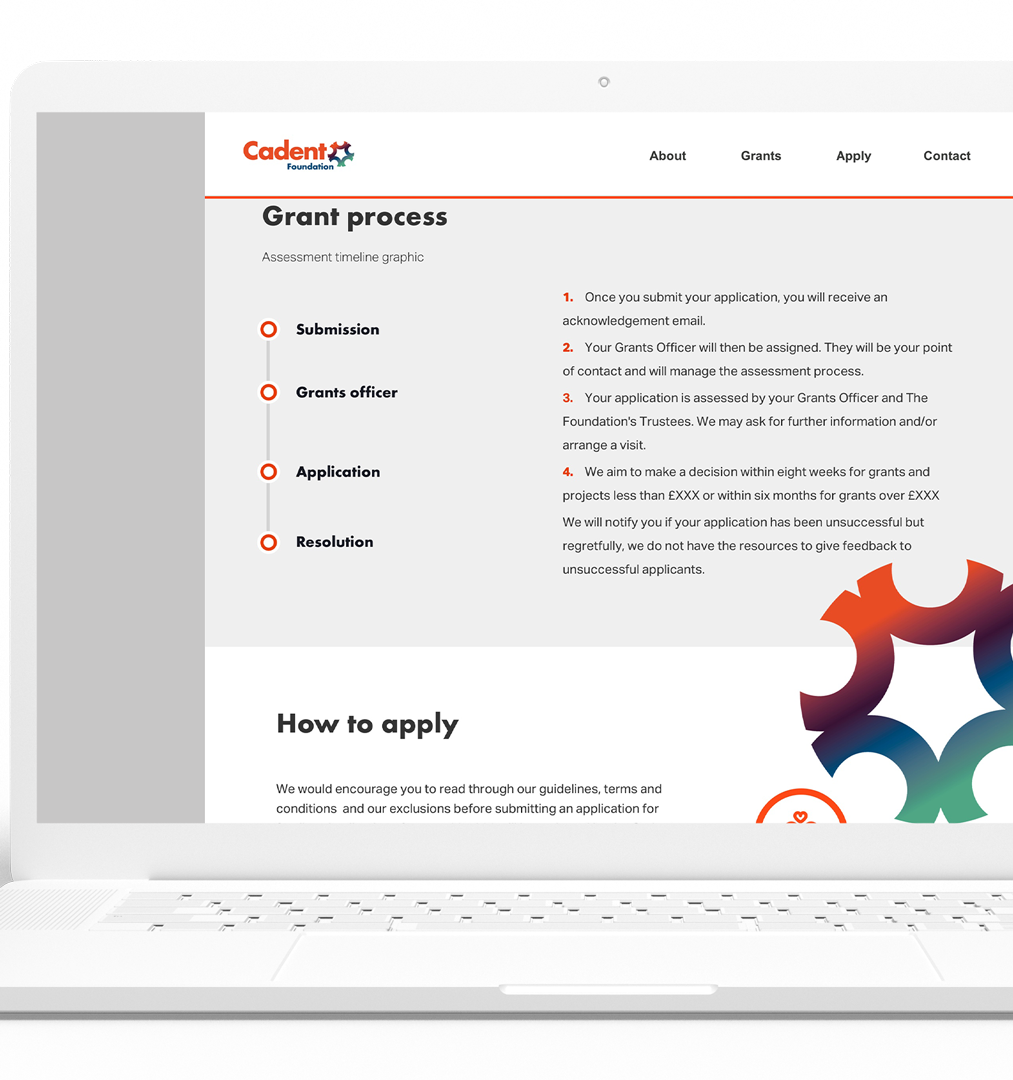
Card and signposting components — reusable card patterns for partners, advice routes, news and impact reports, each with consistent imagery, a short summary and a single clear action, so the site composes from a shared kit rather than bespoke layouts per page.
Responsive layouts — the interface was designed to hold up from desktop down to mobile, since many users in difficulty reach support services on a phone.
Intuitive navigation — a stable primary navigation plus the repeated quick-links pattern make it easy for visitors to navigate, engage with content, and support the Foundation's cause regardless of where they enter the site.
The result is a site where the visual language, the content structure and the navigation all reinforce the same message: warm, credible, and easy to act on for both the people who need help and the partners who help deliver it.
5. Reflections & Takeaways
Designing for the most vulnerable user makes the whole site clearer. Optimising the Advice and Support journey for a stressed, time-poor household produced a site that was also faster and clearer for partners and funders to read.
Brand continuity and charitable warmth aren't in conflict. Inheriting Cadent Gas's typography and motifs gave the Foundation instant credibility, while the flat, warm palette gave it the human tone a utility brand alone couldn't carry.
A charity site's job is often to hand off well, not to keep the user. Because the Foundation funds rather than delivers, the most important design work was making the route to the right partner unmistakable — success looks like the user leaving for help, not staying on the page.
Surface impact, don't bury it. Foregrounding the funding commitment and impact reporting served the partner and funder audience without compromising the help-seeking journey, because the two were given distinct entry points rather than competing in the same space.