Greater London Authority
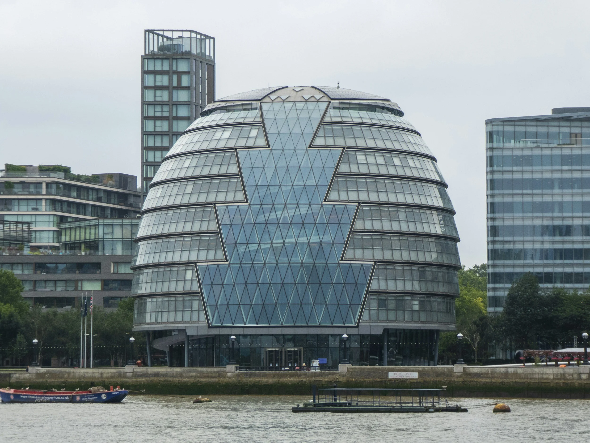
GLA OPS: Designing the Grant Bidding Platform for London's Affordable Homes Programme
Executive Summary
GLA OPS is the Greater London Authority's grant-management platform — the single system through which housing associations, local authorities and developers bid for and report on funding from the Mayor's Homes for Londoners: Affordable Homes Programme 2016-21. I joined to design the user-facing interface and the supporting content suite: a full visual design system, the on-platform UX patterns for a multi-route, multi-block bidding flow, and the user guidance and tutorial videos that providers across London now rely on to submit funding bids correctly first time.
1. Discovery & Research
Understanding the audience
Users spanned the full spectrum: from large national housing associations with dedicated bid teams to small local providers where one or two people did everything from approving users to submitting bids. They needed to bid under one of four funding routes — Approved Provider, Developer-led, Indicative or Negotiated — each with different rules. Mistakes were costly: every avoidable error meant another review cycle with a GLA Area Manager and time lost against the bidding deadline.
Existing-platform and document review
I reviewed the earlier GLA grant tools and the supporting Homes for Londoners Funding Guidance to identify where users were getting stuck. Three patterns came up repeatedly: overlapping or inconsistent terminology, undefined acronyms (RCGF, S106, LAR, LLR, LSO), and bid screens that gave users no sense of where they were in the overall flow. Those became the design priorities.
User Personas
The primary persona we worked to was the small-provider bid lead — under-resourced, time-poor, and often one of just two organisation administrators for their entire organisation.
Show Image
"I just need to know what to fill in, in what order, and what happens if I get something wrong before the deadline." — Bid lead, small provider
2. Ideation & Information Architecture
Mapping the funding routes
I mapped the four bidding routes against the six project blocks (Project Details, Milestones, Calculate Grant, Grant Source, Design Standards, Questions) to identify what was shared across routes, what was route-specific, and which screens needed conditional logic. That shaped the information architecture: a stable project-overview hub the provider returns to between blocks, with tick-state visibility so they always know what's left to do.
Sketching & Crazy Eights
I explored layouts for the project-overview screen — the heart of the platform — to test how to communicate progress, which blocks were complete, which were optional, and how to surface validation without forcing users back to the start.
Low-Fidelity Wireframes
The core focus was reducing cognitive load on screens that ask a small provider to enter unit counts, tenure splits and total development costs in the same view as automatically-calculated grant eligibility. The wireframes were used to test whether providers understood where the system was doing the maths for them, and where they were still in control of the inputs.
3. Iteration & Usability Testing
Testing Method
Participants: providers from across the housing-association and local-authority audience, including consortium leads.
Methodology: task-based walkthroughs of the bidding flow against real funding-guidance scenarios.
Core Task: create a project, complete the six blocks for an Approved Provider bid, then attempt the same project as a Developer-led bid and as a consortium-led bid.
Revisions Based on Testing
Before: the consortium / partnership creation flow was buried inside the organisations menu and providers couldn't find it before they started a project.
After: the flow was surfaced earlier in the journey for organisation administrators, and the user guide and tutorial video were re-cut to introduce consortiums before bidding.
Before: users were submitting incomplete bids because mandatory-field validation was only enforced at the very end.
After: every block displayed a tick state on the project overview so users could see at a glance which were complete; the system permitted save-and-return on incomplete blocks but blocked final submission until everything showed green.
Before: terms like RCGF, nil-grant unit and processing route were undefined on screen.
After: a glossary was published alongside the platform and the key terms were linked inline from the blocks where they were used.
4. Visual Design & Handoff
This was the strand I owned end-to-end: I built the full design system that GLA OPS ships on.
Variables and tokens — colour, spacing, radius and elevation, defined centrally so the same values flow through every screen.
Font styles and paragraph styles — heading hierarchy, body copy, helper text, validation and error states — all defined as reusable text styles rather than re-styled per screen.
Components and variants — form fields (text, number, dropdown, multi-select, currency-formatted), tables (project lists, registration tables, bidding summaries), cards, banners and the project-overview block tile, each with the variants the bidding flow demanded.
Button states — every state for primary, secondary, tertiary and destructive buttons: default, hover, focus, active, disabled, loading.
Patterns — the project-overview hub, the multi-block save-and-continue pattern, the validation/tick-state pattern, the consortium-creation flow and the user-approval flow, all documented so the team could compose new screens rather than reinvent them.
Supporting content — alongside the Figma library I wrote the user-facing guidance (Register, Manage Organisation and Users, Bidding, Glossary) and recorded a series of tutorial videos for the highest-friction flows (Registration, Bidding by route, Consortiums and Partnerships).
The result was that developers could build new screens by composing existing components rather than re-styling, and content writers could update guidance without breaking the visual language. The design system, the in-product UX and the documentation all spoke the same language to the user.
5. Reflections & Takeaways
Design-system investment pays back later. The four-route × six-block matrix would have been unmanageable as one-off screens; building the variants and tokens upfront meant each new combination cost a fraction of the time, both for the team and for any future programme that re-used the platform.
Documentation and product design are the same job. Writing the user guides and recording the tutorial videos surfaced edge cases the screens hadn't yet handled — like users who needed to administer more than one organisation — and those findings fed straight back into the design.
Small providers were the right primary user. Designing for the under-resourced bid lead made the system clearer for everyone, including the larger associations with dedicated bid teams.
Early collaboration with policy and engineering — before any high-fidelity work — meant the design held up against the funding-guidance edge cases (S106 thresholds, RCGF approvals, processing-route logic) rather than being rebuilt once policy review hit.